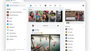
 1. The Facebook layout cover photo size has changed
Although the new size hasn’t changed by much, you may need to make some minor adjustments when creating Facebook cover photos. The old Facebook cover size was 851px by 315px while the new Facebook layout cover photo displays at 820px by 360px on desktop. This means that the width of the cover photos has slightly increased.
Not to worry, we’ve already updated our Facebook cover size and all of our templates inside of Snappa. Please note that the cover photo sizes vary across a personal/business page, an event, or a group.
Along with the change in cover photo sizing, Facebook has also added the ability to add a short video as your Facebook cover photo or even multiple photos as a slideshow.
2. The profile photo no longer overlaps with the cover photo
This is one change that we were very excited to see. The profile picture is now located on the left side of the cover photo.
In addition to the relocation, the Facebook profile picture is now cropped as a circle. Previously, the profile image was cropped as a square, so you’ll want to make sure your profile photo is optimized accordingly.
With the profile picture out of the way, this frees up a lot more real estate on the cover photo itself. You no longer need to worry about accounting for the profile picture on your Facebook banner.
3. The like and share buttons have moved
Once again, Facebook has made the smart decision to move the like, message and share buttons that were previously overlapping the cover photo. Now they appear directly under the cover photo.
In addition to moving the like and share buttons, Facebook has also added the follow button. This allows for visitors to customize the posts they want to see on their timeline even if they’ve liked the page.
If you hover over the “More” dropdown as the Facebook page manager, it gives you a full range of options to edit, view insights, and to share your page.
This means that 100% of your Facebook cover photo will now be visible.
If you’re a page visitor and hover over the “more” dropdown beside the buttons, you’ll have more ways to engage with the Facebook page. You can even provide feedback by suggesting edits which is a neat new feature.
4. The new Facebook layout navigation tabs are relocated
Another thing that’s new is the location of the Facebook page navigation tabs. Previously they were located on the top nav-bar and now they’ve moved to the left hand side of the page.
Previously, you were allowed to manage your Facebook page layout, but they have since removed that feature. You’re no longer allowed to change the Facebook layout of your page
Additionally, you also have the ability to manage your Facebook ads by managing your promotions directly under the left side-bar tab.
Along with the relocation of the navigation tabs, the Facebook sections were also relocated and modified. The sections of your Facebook page are now located on the right hand side. This includes things like community, about, “our story”, and so on.
The right side formerly included events, photos, videos, but now these previous tabs are now grouped on the left side of your Facebook banner as we discussed.
Once again, you’re no longer allowed to customize the right or left tabs. However, in the photo and video tab on the left side of the page, you can add albums and add a featured video to appear on your page.
5. The Call-To-Action button is prominent and customizable
In my opinion, this is one of the best changes that Facebook has made in the new layout. Now all pages have a prominent blue call-to-action button on their page that is fully customizable.
To customize your Facebook CTA button, you will need to hover over the button and click “Edit Button”. From there, you can specify what the button says and the website/app URL.
Some of the other CTA options include buttons like, contact us, learn more, send email, and much more. There’s even specific options if you’re running an app or if you’re selling online with an eCommerce store.
6. You can add a Facebook “Our Story” section
Facebook has removed the search bar that was previously on your Facebook page and have introduced an “Our Story” section. The Facebook “Our Story” for your page is meant to be a glimpse of what your brand and page is about.
In the “Our Story” tab, you’re able to summarize what your business is about and you’re able to upload a Facebook “Our Story” cover image.
7. Add Facebook stories to your page in the new Facebook layout
The addition of the Facebook stories to the platform comes as no surprise.
With the success of Instagram stories, it makes sense for Facebook to incorporate it to the new Facebook format.
On your Facebook page, you will find a new “+” button beside your Facebook profile picture. Clicking on this will allow you to create a Facebook story.
From here, you can customize your story with text on a patterned background or you can upload your own image/graphic. Before you share your story, you can choose whether you want the image to appear on news feed or solely on your story.
It can be hard to keep up on all the social media changes. Yet they all affect your marketing. If you are looking for an experienced social media that keeps on top of things, contact us. We are located in Prince George and can help the small business get noticed.

